Building a website for your business can seem like a daunting task, especially when you may not have much technical experience. 46% of web users judge a brand’s credibility based on its site appearance, according to a study out of Stanford University. As an entrepreneur, you don’t want to risk losing that many prospective customers.
However, designing an attractive, eye-catching website is much more doable than you think. You don’t need a degree in coding to put together a site that draws in – and keeps – future customers.
Today, we’ll dig into the design principles of:
Just remember the following design principles and you’ll end up with a great showcase for your business.
Principle #1: Keep It Simple
Think of websites you may have seen that confused you or turned you away. What did they look like? Often, these webpages may have been cluttered with too many colors, fonts, or heavy chunks of text… all at the same time. Doing too much with your website in this way could come off as if you’re trying too hard.
On the other hand, using a theme layout that’s straightforward in its appearance will look more professional and polished to potential customers. Decide ahead of time what’s important to you, and highlight only those elements. Everything else is just background.
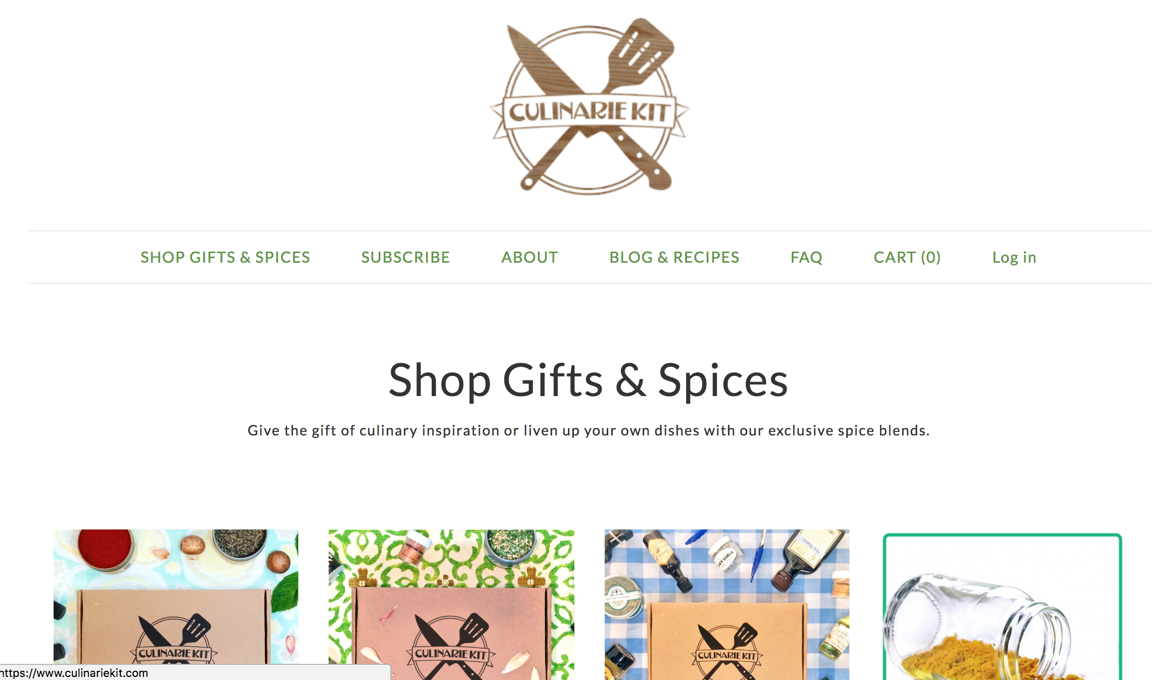
Principle #2: Give Your Color Scheme a Purpose
 Remember that a website is also a type of rhetoric; you’re making a case for why this visitor should sign up for a subscription box with you. For that reason, every decision you make in terms of your site’s appearance should have a purpose. Nothing is arbitrary! And that’s especially true for the colors you choose.
We’re all visual creatures; up to 90% of consumer buying decisions are decided by the product’s color. Consider how certain colors may evoke different moods – or other personal associations – in the viewer. For example, red (an energetic color) is said to inspire hunger, while yellow encourages positivity; blue elicits calm, and darker blues more often appeal to men.
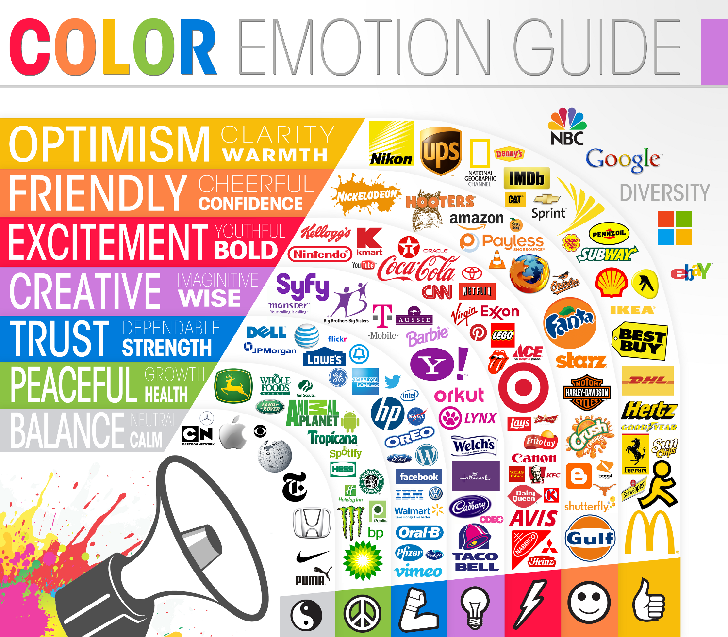
As you design your website – or logo, for that matter – consider your target customer. How might the colors you choose work to appeal to your ideal customer base?
Principle #3: Images are Everything
We live in the age of Instagram, when it seems like everyone has access to a phone with a good camera. So it almost goes without saying that visuals are crucial to selling your products, whether you specialize in handmade aromatherapy candles or survivalist gear.
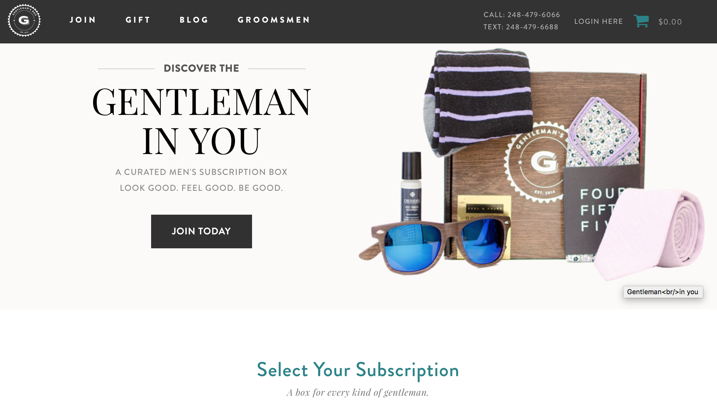
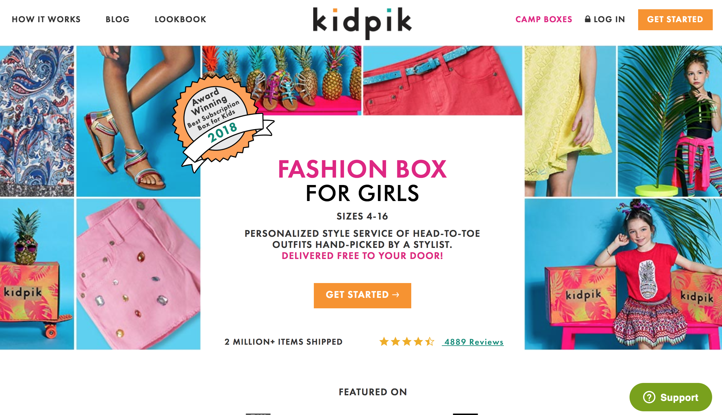
The most eye-catching website designs put images that represent their product or service front and center. (Remember Principle #1: images like this get across your message faster and more simply than a big chunk of text.) If you can, we recommend that you invest in a professional photographer to take images of your subscription box (see examples from Dungeon Crate here). Stock photography has been around so long that people can recognize it right away. You don’t want to come off as a shell of a brand.
Discounts for Cratejoy merchants: Our photography partners, Allie Dorobis and Becca Bond, offer special deals for sellers on the Cratejoy Marketplace. Check out their sites to see more!
If you can’t afford a professional yet, practice taking photos with your smartphone camera at different times of day; natural light is best to showcase your products, but the quality of light will change throughout the day. Experiment.
And if you’re totally lost, check out Cratejoy’s guide on how to take high-quality photos.
Principle #4: What’s Your Function?
So far we’ve discussed the aesthetic of a successful website: the specific elements it incorporates to look good and keep viewers’ attention. But that’s only half the battle, of course. A great first impression won’t matter if your site doesn’t work.
Every successful website is ultimately about (and for) the customer, not the business. What does your customer need from you? Think about this not only in terms of your product but in terms of navigation. How will your customer use your site? Why do they access your site in the first place, and what’s most important for them to find?
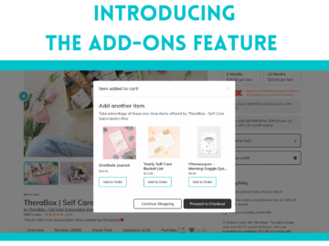
As you build your website, keep user-friendliness at the top of your mind. Offer call-to-action (CTA) buttons on your pages and label the navigation menu clearly. Now is not the time to get cutesy with captioning.
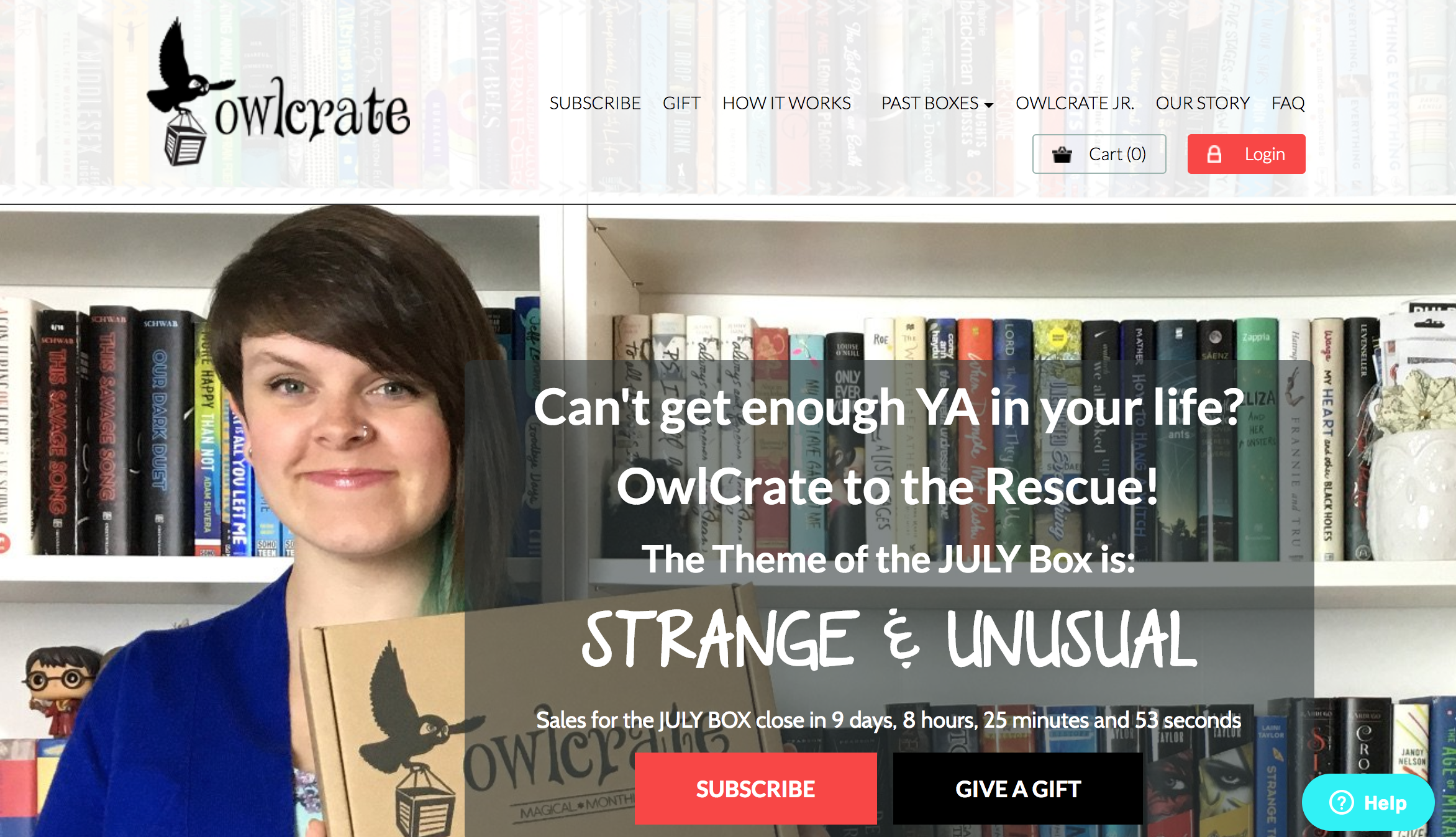
Check out the OwlCrate example above. The homepage is image-forward and gets across the purpose of their box (and the monthly theme) right away. The navigation menu options up top are titled straightforwardly, while the main CTA buttons (“Subscribe” and “Login”) stand out. The “Help” button, too, pops from their use of color. All these choices make it easy for prospective customers to find what they need.
Principle #5: Consistency
This principle is really just an extension of #4. Every type of media has its own language; we learn to “read” (in this case, navigate and understand) a website the same way we do a book or movie. So you want to make sure that the design rules you set up for your homepage don’t radically differ on other pages across the site.
For example, if you always use H1 for headings and H3 for subheadings, do that across all pages; if you use purple to highlight a CTA button, do that throughout. If your pages look totally different from one another, it’s going to come across as disorganized, confuse your visitor, and potentially lose you a customer.
It’s always a good idea to ask a friend to look over the site before going live. If they have questions about how to find certain information or are unclear on what you mean by something, your site isn’t as user-friendly and consistent as it could be. Catching those tweaks early is a smart move.
Need Some Inspiration?
Take a look at this list of well-designed websites by Cratejoy merchants for ideas on how to design your site. When you’re ready, our Design Store is waiting for you with over a dozen customizable themes!